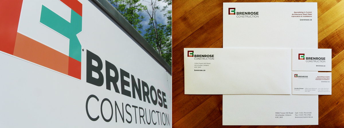
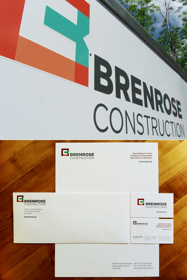
Based out of Ottawa, ON, Brenrose Construction is a small business specializing in architectural sheet metal work, mostly with copper. Owned and operated by a master copper and metal smith, Brenrose Construction provides clients with personalized quality services while preserving the craftsmanship found in old world metalworking.
The brand design requirements were straightforward; visual impact from a distance, simplicity and a modern look. The colours used represent new and patinated copper, while the type is set in a slate-like grey for balance. The 'B' icon, for Brenrose, is purely geometric in its construction, relating to its setting. The 'C', for Construction, is formed in the negative space of the 'B' symbol. The final mark relays the message of superior craftsmanship, strength and reliability.

