Pope Properties, located in Greenwood, MO, is a privately owned property management company established to offer quality and affordable housing in western Missouri.
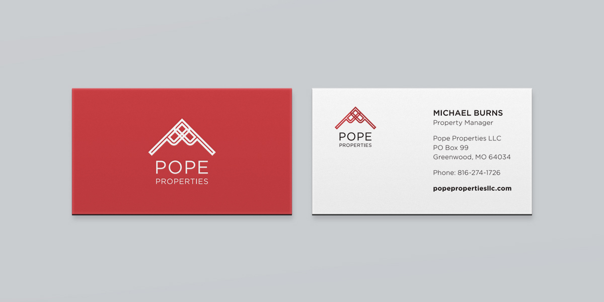
Upon the start of the company, a brand new identity was created. Due to the nature of the industry, a clear and concise solution was the goal. The primary mark features 2 overlapping 'P's (for Pope Properties) which form a roof/peak figure, with the type aligned underneath it completing the shape of a house. The type is capitalized and set in pure black as it must read well from a distance, given that the mark is applied to signage on properties. The result is an identity that provides a clean and professional look for a very competitive marketplace.

 /
/